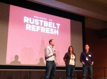
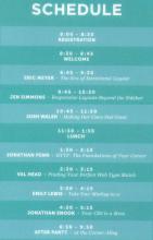
Writing about the May 3, 2013, Rustbelt Refresh Conference (RustbeltRefresh.com - @RustbeltRefresh) is difficult, since there was so much interesting information shared at the meeting that it is impossible to include it all.
First, I want to send a big thank-you to Brad Colbow, Brad Dielman, and Bridget Stewart for their leadership in making this Cleveland conference dedicated to web design and front-end development a reality! (Follow/view: @BridgetStewart - ShallowThoughts.org; @BDielman - BradDielman.com; @BradColbow - ColbowDesign.com) I am looking forward to their next Rustbelt Refresh Conference in 2014!
I also want to put in a plug for Cleveland Public Library (CPL.org - @Cleveland_PL) as the conference location. I recently learned about all the computer training resources available at Cleveland Public Library's TechCentral. TechCenral is located next to the auditorium we used for the conference. Learn more about TechCentral online here. The auditorium meeting space has a modern feel to it that worked well for the Rustbelt Refresh Conference. The only downside was that the room is not wired with the many electric outlets needed by participants with laptops at an all-day conference. I was able to tap into the power supply of the sound system with my own extension cord, and shared the power with others.
The Era of Intentional Layout
Eric A. Meyer (MeyerWeb.com - @MeyerWeb)
Timing is everything! Eric Meyer kicked off the conference by talking about important Cascading Style Sheet 3 (CSS3) elements. One year ago, in a CSS3 class that I took, these CSS3 items were presented as too experimental to bother learning for the browsers at the time. One week ago, in the Advanced Layout and Animation discussion at the Cleveland .Net Study Group, they were presented as being important to use today. (See Flexbox and Grid links I shared with the Cleveland .Net Study Group participants on April 24, 2013.)
The most important take-away from Eric's talk is that it is a vital job skill to be able to let go of our old limitations. The "era of intentional layout" means we now will have the power and control to do web layout the way we want to, but to do this we will need to get rid of our old parameters.
Resources:
- Get these books if you have a child:
#HTML for Babies
CSS for Babies - I highly recommend seeing Dave Mead's "Eric Meyer - The Era of Intentional Layout" notes.
- W3C - CSS Values and Units Module Level 3 - Viewport-percentage lengths: the ‘vw’, ‘vh’, ‘vmin’, ‘vmax’ units
- An Event Apart: Strong Layout Systems by Luke Wroblewski
- Eric Meyer: “The Era of Intentional Layout” PUBLISHED FEBRUARY 22, 2013 BY CHRIS COYIER
- W3C - CSS Flexible Box Layout Module
- W3C - CSS Grid Layout
- As mentioned above, see Flexbox and Grid links I shared Cleveland .Net Study Group participants on April 24, 2013.
Responsive Layouts Beyond the Sidebar
Jen Simmons (JenSimmons.com - @JenSimmons)
Homework! Let's start with the homework that Jen Simmons gave to all the attendees -- watch Karen McGrane's (@KarenMcGrane) Adapting Ourselves to Adaptive Content.
Karen McGrane: Adapting Ourselves to Adaptive Content - An Event Apart from Jeffrey Zeldman on Vimeo.
Karen McGrane's slides and a different version of the video found here:
Adapting Ourselves to Adaptive Content (video, slides, and transcript, oh my!)
Jen showed several websites that were good examples of responsive design. After the meeting, Jen shared via Twitter a great Firefox browser tool to view websites.
Hey everyone at @rustbeltrefresh wondering about the RWD tool in Firefox tht I used. It's not add-on, it's built in! developer.mozilla.org/en-US/docs/Too…
— Jen Simmons (@jensimmons) May 7, 2013
Here are some of the websites we viewed at the meeting. I suggest trying to look at them using the Firefox Responsive Design View feature (try on the keyboard, press ctrl-shift-M on Windows or Linux, or cmd-option-M on Apple).
- http://www.dacs.org.uk/
- http://quarterly.co/
- http://www.anderssonwise.com/
- http://www.fhoke.com/
- https://medium.com/
Jen noted that cursive writing is no longer taught to 4th graders, since this skill is not needed anymore. She went on to suggest that schools should teach HTML as a logical, useful replacement. The idea of teaching HTML to students appears to me to be a recurring theme (examples I have found: Code.org; Mashable's students should ALL know: "6. HTML and Basic Coding").
From my notes, I wrote the following to represent the process Jen presented for web design. It is an oversimplification of what she presented, but it is worth noting that the process starts with content structure.
- Design Content Structure
- Design Source Order
- Design Narrowest Layout (somewhat)
- Design Wider & Wider Layouts (& narrow)
Resources:
- Learn CSS Layout - LearnLayout.com
- Gridset tool for making grids
- The Web Ahead - A weekly podcast hosted by Jen Simmons which is about changing technologies and the future of the web, discussing HTML5, mobile, responsive design, iOS, Android, and more.
- Here is Jen's description of her Responsive Layouts Beyond the Sidebar talk, and a list of her presentation locations.
Making Our Users Feel Great
Josh Walsh (MadeForPeople.net - @JoshWalsh)
I was fortunate to have Josh Walsh do the first public presentation of Making Our Users Feel Great: The Psychology of Making Things Easy to Use at my February 16, 2013, WebSigCleveland.org meeting. He wanted to kick off his first nationwide talk here in Cleveland, and I was pleased that he approached me to speak at WebSigCleveland.org. Information on the Josh's #UXtour.
Now at Rustbelt Refresh, doing his 33rd presentation, he still has the fire for the subject of focusing on users. A large part of his presentation involved stories that have successful user focus. Here is a video about one such success story.
I share Josh's strong beliefs about the importance of culture within an organization, and think it is exciting that his career provides him with great opportunities to see this in action. Josh says it is most important to design culture first. He recommends hiring employees who are a good fit for the organization's culture, since you can always train for skills.
HTTP: Get to Know the Foundations of Your Career
Jonathan Penn (CocoaManifest.net - @JonathanPenn)
"daddy, what is ach-tee-tee-pee?" :) HTTP: Get to Know the Foundations of Your Career w/ @jonathanpenn#rustbeltrefresh
— David Wickman (@davidwickman) May 3, 2013
"Daddy, what is ach-tee-tee-pee?" - Jonathan Penn presented an incredibly witty look behind the scenes at all of our favorite protocol -- Hypertext Transfer Protocol (HTTP) -- through his son's inquiries. Yes, we learned the "facts of life" of HTTP.
Jonathan described how information is passed between a web server and client in the header, and the evolution of standards to simplify this process. I highly recommend seeing Jonathan's talk if he reprises it at another conference.
Resources:
- 1xx Informational
- 2xx Success
- 3xx Redirection
- 4xx Client Error
- 5xx Server Error
- MIME types were originally for email types (note "mail" in full name: Multipurpose Internet Mail Extensions), now used for many Internet media types.
From my notes: - GET - To get something from the server without any changes on the server.
- POST - Make a change on the server.
- PUT - Update something on the server.
- Use Chrome browser to look at code in header:
- In Chrome browser, open Developer Tools
- Load (re-load) the web page for which you want to view the header (must do this after Chrome Development Tools is open, so it can capture the information).
- Click on the Network column tab.
- On the left side listing, click on the page you loaded.
- Click on Headers tab.
Here is a screen capture I made to view header information in Chrome.

Enlarge Image
Finding Your Perfect Web Type Match
Fonts have roles. Val Head shared with the Rustbelt Refresh Conference attendees that many typefaces were designed to solve specific problems. She pointed out that since most fonts were designed before the Internet, why should we expect them to work well with the Internet? It did not matter much when fonts were provided to the client's browser from the their local machine, but with the 2010 start of embedded fonts, the web design world changed. We can now use many more fonts than in the olden days, when we would only pick from low resolution fonts like Verdana and Georgia.
I was particularly interested in Val's talk, since I had presented a talk last year at the Cleveland Digital Publishing Users Group (CDPUG.org - @CDPUG) on Web Font Design: You Don't Have To Be Angry Anymore. My presentation was more on the technical side of things, so I enjoyed hearing Val present on the history and design of fonts. (See my blog posts: Web Font Design and Web Font Design - Part 2.)
Here are Val Head's Finding Your Perfect Web Type Match slides:
Finding Your Perfect Web Type Match by Val Head
Published May 3, 2013
Here is Val's response when asked about her favorite fonts:
@willkesling I don’t. :)But some of my favs are proxima nova, facit web, ff tisa and ff meta serif.
— Val Head (@vlh) May 3, 2013
Remember that “Free web fonts are about as good as free fonts” (i.e., you get what you pay for).
Resources:
- WhatFont - Chrome extension that lets you inspect web fonts by just hovering on them. It also detects the services used for serving the web fonts.
- FONT FOUNDRIES MUST DIE!
- Say No to Faux Bold by ALAN STEARNS May 08, 2012
- My blog posts:
Take Your Markup to 11
Emily Lewis (aBlogNotLimited.com - @EmilyLewis)
“Don't be average.” Emily Lewis shared information on POSH (Plain Old Semantic HTML), new HTML5 elements, Microformats, Microdata, Aria, and challenged us to not be average -- to take our markup to 11!
Emily provided such a great list of resources in here slides and in her list of links, I decided to include them here:
Take Your Markup to 11
Rustbelt Refresh | May 3, 2013
EmilyLewisDesign.com/RustbeltRefresh
Miscellaneous Links
- Seth Godin interview on George Stroumboulopoulos Tonight
- Spinal Tap clip
- Our (CSS) Best Practices Are Killing Us
- Understanding CSS Selectors
- Findability, Orphan of the Web Design Industry
POSH Resources
- Keep it Clean: Your Blog and Clean HTML
- POSH - Plain Old Semantic HTML
- Meaningful Markup: POSH and Beyond
- The Beauty of Semantic Markup series
- Our Pointless Pursuit of Semantic Value
HTML5 Resources
- HTML5 Cookbook
- Understanding HTML5 Validation
- HTML5 Sectioning Element Flowchart
- HTML5 enabling script
- Using HTML5 semantic elements today
- HTML5 for Web Designers
- HTML5 Doctor
- The Importance Of HTML5 Sectioning Elements
- Further examples on using the main element
- Using HTML5's New Semantic Tags Today
- The Truth About HTML5
Microformats Resources
- Microformats Made Simple
- Rich snippets (microdata, microformats, RDFa, and Data Highlighter)
- H2VX Contacts Conversion Service
- Operator add-on for Firefox
- Tails Export add-on for Firefox
- Microformats extension for Chrome
- SafariMicroformats plugin for Safari
- microformats.org
- microformats2
- microformats2 & HTML5 — The Evolution of Web Data
- Extending HTML5 — Microformats
- Getting Semantic with Microformats series
Microdata Resources
- Schema-org, microformats and more science please
- Future-Ready Content
- Extending HTML5 — Microdata
- Microformats, HTML5 & Microdata
- Schema.org
ARIA Resources
Your CSS is a Mess
Jonathan Snook (Snook.ca - @SnookCA)
SMACSS (Scalable and Modular Architecture for CSS). Starting with ideas in his SMACSS book, Jonathan Snook presented a different way to organize your CSS. I thought his naming conventions were interesting, since they allowed for easy updates. I also found it interesting how he recommended using classes rather than ID for CSS, and how he demonstrated using child-selectors from the classes.
Here are Jonathan's Your CSS is a Mess slides from his talk at the Smashing Conference 2012 Conference. You can learn about Jonathan Snook's speaking engagements/topics here.:
After Party at the Corner Alley
The after party at the Corner Alley (@TheCornerAlley) was great. I really enjoyed having time to talk to new people and re-connect to others.
Thank you, Josh Walsh (@JoshWalsh), for having Designing Interactive (DesigningInteractive.com - @we_are_di) sponsor the Rustbelt Refresh After Party.
Wow, this is really a gr8 time!! After @rustbeltrefresh party @thecorneralley. #RustbeltRefresh #HappyInCLE
— Stuart O. Smith, Jr. (@sos_jr) May 4, 2013
After a full day and evening at Rustbelt Refresh, I went on to continue my evening/early morning at the Bal Ingénieux. To read about this, see my Bal Ingénieux, Ingenuity Cleveland blog post.
Gr8 time at After @rustbeltrefresh party @thecorneralley. Now time for party at @ingenuityfest's BalIngenieux.com. #RustbeltRefresh
— Stuart O. Smith, Jr. (@sos_jr) May 4, 2013
What Others Say
In my blog posts, I always like to include what others have to say. Be sure to read these:
-
Rustbelt Refresh 2013 The conference in review - David Mead (@DavidMead)
-
Eight Takeaways from Rustbelt Refresh - Deborah Edwards-Onoro (@redcrew)
If you know others who wrote about the Rustbelt Conference, please contact me via Twitter, or leave a comment below. Thank you.
#RustbeltRefresh Tweets
I always like to share tweets from events I attend. They often provide links to useful information, and great photos of the event. Don't miss out -- be sure to read the #RustbeltRefresh tweets. #FF -- I recommend that you follow these Rustbelt Refresh attendees on Twitter.
The JavaScript used by Twitter to correctly display tweets did not work with the large number of tweets. I split them into two HTML files shown in an iFrame. Click on links to view and give it a little time to load with the Twitter JavaScript-created view:


